ShopDreamUp AI ArtDreamUp

Deviation Actions


Suggested Deviants


Suggested Collections


You Might Like…


Featured in Groups


Description
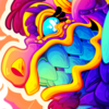
Prepare to bow Popstar...Welcome your new overlord!
YAY the first picture of 2012! And it's not Pokemon related! HUZZAH!
I finished the main plot of Kirby: Return to Dreamland a few days ago, and it is AMAZING! They really went all out on this game! I'm trying to beat extra mode now, but it's haaaaard!!
The final boss, without giving anything away. Although it should be obvious by now who the final boss is -.-|||
I plan on making this my new wallpaper, which is why it's funky proportions.
I couldn't decide how I wanted to shade the picture. It was between either gradient or cell. I decided to try and combine the two. How'd I do?!
Image size
1366x768px 1.28 MB
© 2012 - 2024 Artivox
Comments55
Join the community to add your comment. Already a deviant? Log In
How amazing I must say, The lighting and the shape of the character is beautiful and you can clearly see what this is showcasing when your a fan of the games in kirby. However I'm not here to critique the character but the art in general. While there may be some great choices it lacks a few things, overall this was a Great piece and you did well.
Vision
When you look at it straight from the thumb, before clicking on it, it pops out and gives you an aery feeling on what it is. You want to see all the details and know who it is. As soon as you get to full view its stunningly striking as a dark character in Kirby (er... more or less) I can see what it is quite well, especially because of the text. However, the text is completely basic and not exactly fitting with the background. It's very understanding to use a Font tool rather then try to write the letters yourself, but you should edit the text or use the right style of text. For instance Papyrus is good text for a creepy image. Always take your time with the text. sometimes look online for some to download and use as well, or even create your own text if your talented enough. but this plain text is a little.... boring compared to the rest of the image.
Another thing is the lighting. As good as the shadows are it would be good to sprinkle in a few more lights in the back of him because of the background. Of course this could also be confusing. What you did here for lighting was wonderful, and I wouldn't change it, but you may want to experiment with what the light could have done if more of it came from the background. Oh... the finger.... it's a little big and the hand also seems a little to mushed, I suppose that is the style of Kirby however so.... I won't say to much on that.
Originality
Well I will admit it doesn't feel unique or original at all, mostly cause of the point of view, the fact that it's Kirby fan art, and the style isn't entirely to different to me them most digital styles. But I'll get back to the style of it during my information on Technique. It immediately felt like a traditional bad guy scene where he's huge and it shows his ultimate dream of taking over what ever he desires. However it does look good this way and I think it was good to draw it this way as it is fan art and not something you created yourself. Leave the good original art designs for stuff you create. :3
Technique
The image is bold and colorful, you can see the texture and the shades and highlights and even some of the light sources. As beautiful and stunning this is, it's not all that original. It's good however, and pleases the eye quite well, but I feel like I've seen al of these techniques before. It's not a bad thing to have your art like this but I'm having a hard time catching a signature (not a written but more of in the way you draw.) It's good.
Impact
Well its bold, its pretty good and I love the colors. I like how this came out and it made me feel very great to see this. Good art on any terms deserves great respect. It might make me think a little on art. despite its lack in originality it is sure nice to look at and I'm glad I ran into the piece. It has impacted me as it has beautiful shading and other things about it that are good. I do want to mention though that because it is fan art, it's impact ranges for everyone.
Conclusion
I hope this has helped you an any way my friend, and I hope it didn't sound to much like a comment. Keep up the good work, and have fun :3